.png?width=140&height=37&name=BLAZE-Logo-Blue%20(2).png)
The Site Theme panel lets you make changes that affect your entire site. You can customize your site's text, buttons, images, background, and navigation widgets from the design panel. This allows you to quickly and efficiently make sweeping visual changes, reducing design time and keeping your site's style consistent across pages.
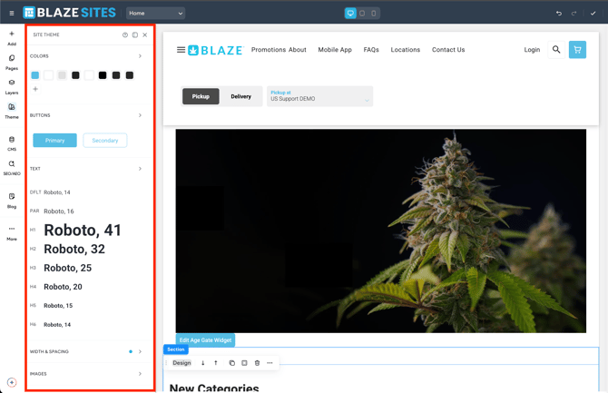
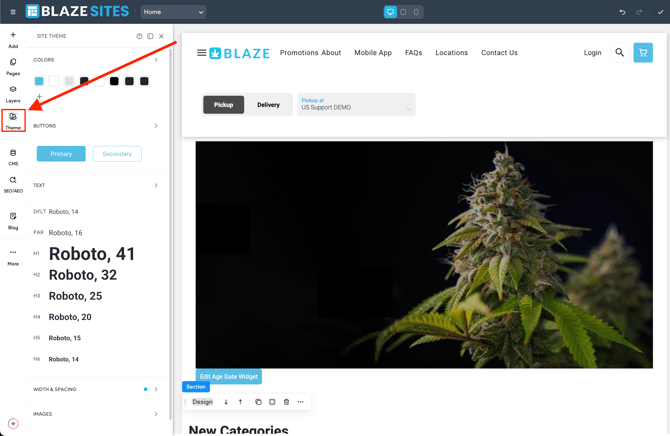
To open the Site Theme panel, in the side panel, click Theme. When the Site Theme panel is open, the canvas is automatically minimized to 50% view so that the entire canvas is visible while adjusting the site theme settings. If you want to return to 100% canvas view, click the drop down in the top bar and select 100%. The ability to zoom in or out is also available in preview mode.
🚨 BLAZE ECOM Widgets Note:
Design styles for custom BLAZE ECOM widgets cannot be modified through the Site Theme panel. Any styling changes are controlled only through the widget-specific configuration settings outlined in this documentation.
💡 Changes that you make to specific widgets or pages will override themes set in the Site Theme panel. We recommend you first decide on a site theme, and then make customizations to parts of your site that you want to stand out or look different than the rest.
This section lets you control text for your site, both for text and headings of all sizes (H1 to H6). Change the style and look of the text on your entire site. You can change font type, size, and also choose settings for normal text, links, and titles.
Changing the font size, style, color, and other edits will affect future paragraphs, and other text types as well as current widgets connected to Site Text that have not been manually changed.
Configure Theme Text
To configure theme text:
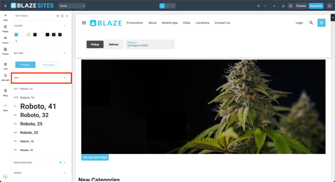
- In the side panel, click Theme.
- Click the arrow next to Text.
- Click the desired text type. The options are:
- DFLT. This will set the theme for all text in widgets that are not assigned to a heading or to the paragraph style such as the navigation widget. Link text color and underline can also be set here. Additionally, you have the option to customize the appearance of links for different states, including the Default Link State, Link On-hover, and Link Clicked.
- PAR. This will set the theme for the text widget.
- Heading and subheadings H1-H6.
- You can change the following per text type:
- Font
- Font size. This is set for desktop/tablet and mobile, separately.
- Scale text. When enabled, the text scales based on the parent container's width. This can be helpful if you do not want a line break in a heading. Widgets with text that are connected to the theme will inherit this setting, however the setting can be overridden per widget.
- Font color
- Font format
- Text direction
- Font weight
- Line height
- Letter spacing
- All caps
- Text shadow
Making changes in the Theme text area changes all text in the site that is not overridden by individual, custom style changes. When manual edits are made to individual elements it overrides the site theme and any changes made to the site theme will no longer affect the style of these elements. This is at the individual style settings of a certain site element, for example, if you only changed the color of the text in a particular H1 widget on the canvas:
- And then changed the font size of H1 in the site theme, the H1’s font size will still change in the H1 widget.
- And then changed the color of H1 in the site theme, the H1 that had been changed will not update with the color change.
Update Theme Text
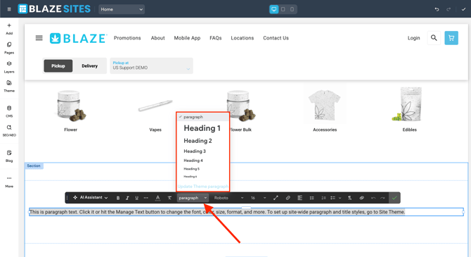
You can update theme text in the text settings by clicking Theme, then selecting Text. Or, you can click a text widget to open the context menu, click the heading selection drop down, and select Update theme. This opens the theme text settings where you can make updates.
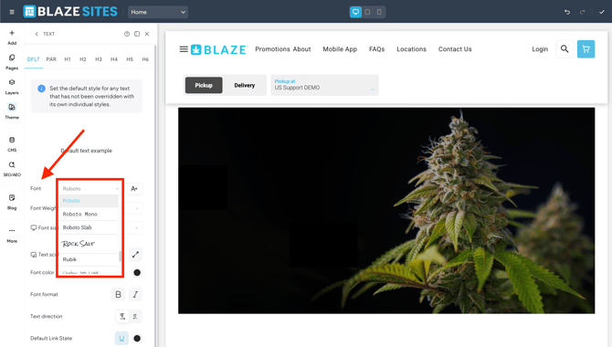
Fonts Library
The editor features a variety of fonts for your use. Set a theme text font or choose to differentiate your text by using multiple different fonts on your site.
To view available fonts and see what they look like:
Colors allow you to define a color palette and link the individual colors to any or all widget with color settings. The color of any element that is linked to the theme colors will automatically be updated when the linked color is changed in the theme colors settings. This allows you to quickly make color changes, which helps reduce design time and ensures your site's style is consistent across pages.
Account owners automatically have Editor permissions and can edit, view, and use theme colors. Team members and clients who do not have Editor permissions can view and use theme colors, but they cannot edit them.
Configure Theme Colors
You can configure up to 30 theme colors.
To configure theme colors:
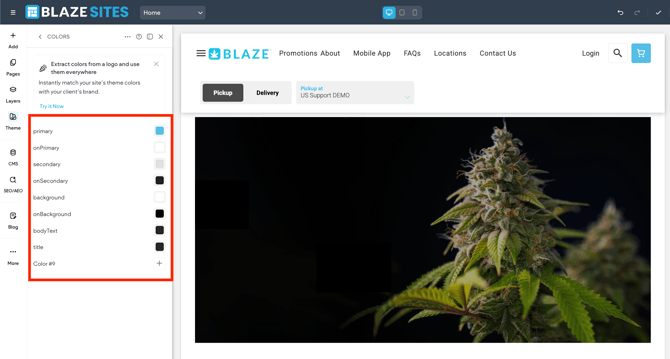
- In the side panel, click Theme.
- Select the arrow next to Colors.
- Click the Plus icon next to Primary, or whichever setting you need to define.
- Type the HEX or RGB value of the desired color, or use the eye dropper tool to select a color.
- (Optional) You can generate colors from your logo. Click to open the primary color, then open the Brand tab and click + Add Logo (if you added a logo to your Business Info in the Content Library, it will appear here). After adding your logo, a set of colors is generated.If you need to remove or replace the logo, click the three dot icon next to your logo and select either Remove or Replace Image. Note that you need Content Library & Business Info permission to upload, remove, or replace the logo.
Repeat these steps as necessary for each theme color.
Rename Theme Colors
🚨 It is not recommended to rename the colors already named.
e.g.: primary, onPrimary, secondary, etc.
To rename theme colors:
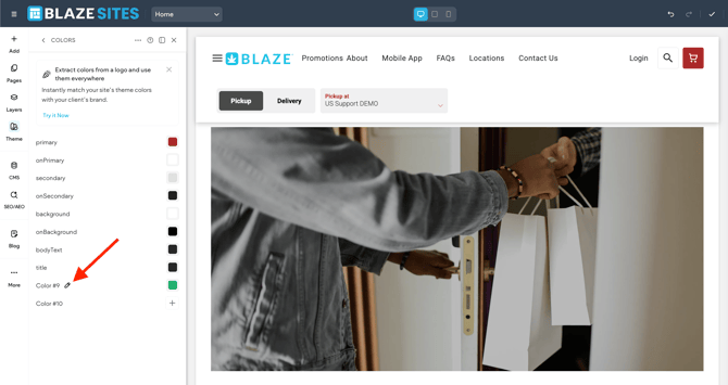
- In the side panel, click Theme.
- Click Colors.
- Hover over the desired color name and click the pencil icon.
- Type a new name.
The new name is automatically saved and will appear when hovering over the color in the color picker.
Remove Theme Colors
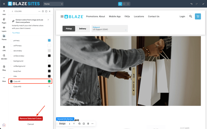
You can disconnect any widgets connected to individual theme colors.
To disconnect a widget:
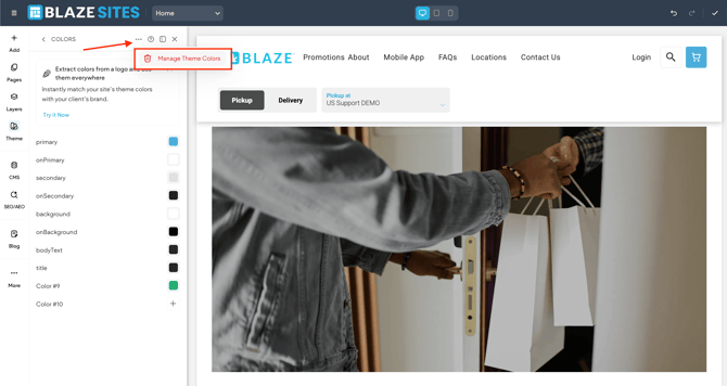
This section lets you define the style of primary and secondary button widgets on your site. Select one of our button layouts and set the text, background color, border, hover state, corners, and shadow styles.
To hide the Back to Top button on mobile, enable the toggle in the Site Layout section.
This section lets you control the style of the image widgets on your site. You can change the image layout, add or edit the border style, rounded corners, or shadow effects.
Customize Site Background
To customize your site background:
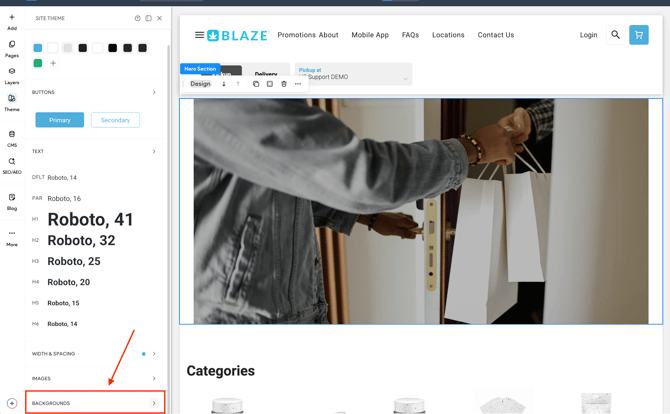
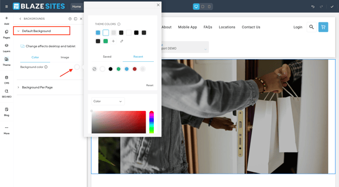
- In the side panel, click Theme.
- Click the arrow next to Backgrounds.
- Click Default Background.
- Click either the Color or Image tab or select a color for the site background or upload an image.
- (Optional) Click the Do not optimize this image toggle to prevent optimization (this setting will appear after an image has been selected).
Customize Background Per Page
To customize the background per page:
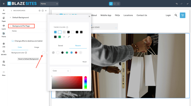
- In the side panel, click Theme.
- Click the arrow next to Backgrounds.
- Click Background per page.
- Select a page from the drop-down menu, and select image or color for the specific page.
- (Optional) Click the Do not optimize this image toggle to prevent optimization (this setting will appear after an image has been selected).
From the Theme panel, you can adjust your site layout, which includes setting page width; and default section, column, and inner column spacing.
To access site layout settings:
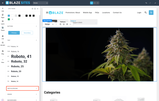
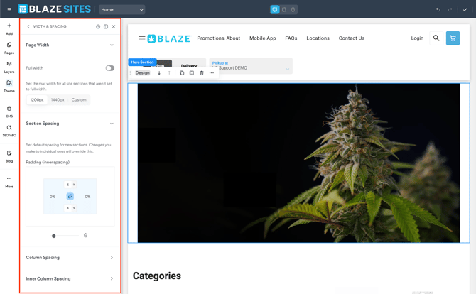
Page Width
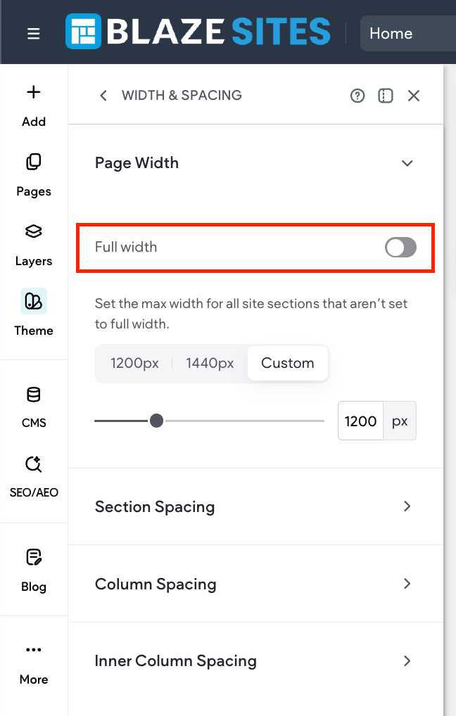
You can set the default page width for sections not set to full width (previously called “full bleed”) on desktop. Adjusting the default page width can help ensure the best readability and design for the site for how it will be displayed. For example, some websites are displayed on a tv screen or screens larger than the average desktop computer.
To set default page width:
- In the side panel, click Theme.
- Click Width & Spacing.
- Click to expand the Page Width section.
- Select either 1200 px, 1440 px, or Custom. If you select Custom, use the slider to select pixel width or enter a value in the field. The custom value can be between 960px to 1920px, or between 50 vw to 100 vw.Enable the Full width toggle if you want all new sections to have full width by default.
Section Spacing
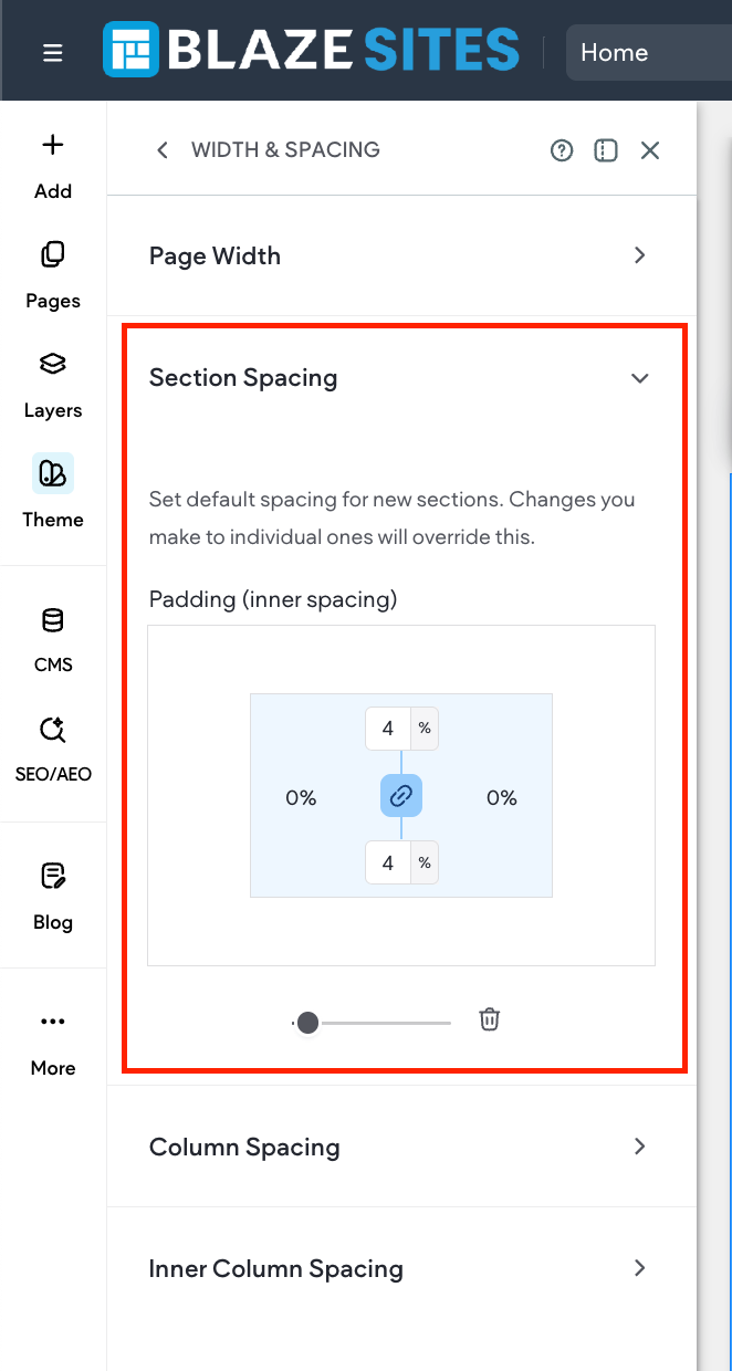
You can set the default padding for new, blank sections added to your site. If desired, you can override the theme section spacing in the section’s design panel.
Important considerations:
- Sections added to the header retain the default header spacing, regardless of what is set in the theme’s section spacing.
- Note that sections created prior to this feature release (August 5, 2025) do not automatically inherit the Section Spacing padding, however they can be reconnected by opening the section's design panel and clicking Reset to theme spacing in the Section Spacing drawer.
To set section spacing:
- In the side panel, click Theme.
- Click Width & Spacing.
- Click to expand the Section Spacing section.
- Click in the respective boxes to edit the padding values. The horizontal padding values are linked. If you change one, the other will automatically update. They can be unlinked by clicking the link icon. Note that section spacing is set per breakpoint.
If necessary, click Reset padding to reset all values to zero.
If you modify an individual section's padding, it overrides the theme settings. You can reset it back to theme Section Spacing settings by opening the section's design panel and clicking Reset to theme spacing in the Section Spacing drawer.
Column Spacing
You can set the default padding for new, blank columns added to your site. If desired, you can override the theme section spacing in the column's design panel.
To set default spacing for columns:
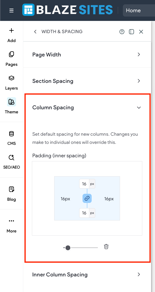
- In the side panel, click Theme.
- Click Width & Spacing.
- Click to expand the Column Spacing section.
- Click in the respective boxes to edit the padding values. The vertical padding values are linked. If you change one, the other will automatically update. They can be unlinked by clicking the link icon.
Inner Column Spacing
You can set the default padding for new, inner columns added to your site. If desired, you can override the theme section spacing in the inner column's design panel.
To set default spacing for inner columns:
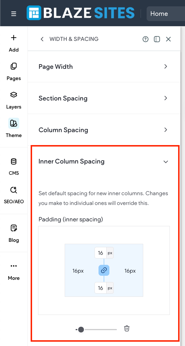
- In the side panel, click Theme.
- Click Width & Spacing.
- Click to expand the Inner Column Spacing section.
- Click in the respective boxes to edit the padding values. The vertical padding values are linked. If you change one, the other will automatically update. They can be unlinked by clicking the link icon.