.png?width=140&height=37&name=BLAZE-Logo-Blue%20(2).png)
Overview
The Loyalty Dashboard is found under Growth → Loyalty → Dashboard tab. It's visible to any store with Growth Loyalty enabled.
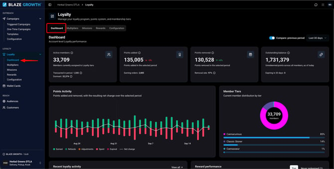
The dashboard has four parts: a KPI row at the top, a Recent loyalty activity feed, a Points Activity chart, and a Reward Performance card. All of them are scoped to the date range you select at the top of the page.
KPI row
Four cards summarize the program for the selected date range:
- Active members - members currently assigned to Loyalty Tiers
- Points added/earned - points added in the selected period
- Points removed/redeemed - points removed in the selected period
- Outstanding balance — unredeemed points across all members, as of today
Each card shows whether it's up or down compared to the period immediately before it. If you'd rather compare against a specific period instead, use the Compare: previous period control next to the date range — turning it on replaces the automatic comparison.
Below each headline number is supporting detail:
- Active members: how many transacted in the period vs. went dormant
- Points added/earned: how many orders earned points
- Points removed/redeemed: the redemption rate (points redeemed ÷ points earned for the same window)
- Outstanding balance: points expiring in the next 30 days

Points Activity chart
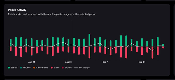
This chart shows how member point balances changed over the selected period — not just points earned vs. redeemed, but every kind of balance movement, including manual adjustments, expirations, reversed earnings, and refunds.
Bars are split above and below a zero line: points added grow upward, points removed grow downward. Each bar is broken down by source — purchases, spending, refunds, adjustments, and expirations — and a line drawn over the bars shows the net change in total member balances for that period. Hovering over a bar shows the full breakdown behind it.
The chart supports 7-day, 30-day, 90-day, and Last Year views.
The KPI cards use the same definitions as the chart, so the two always agree — this is also why the labels are "Points added/removed," and "Removal rate" is points removed ÷ points added for the period.
Member Tiers
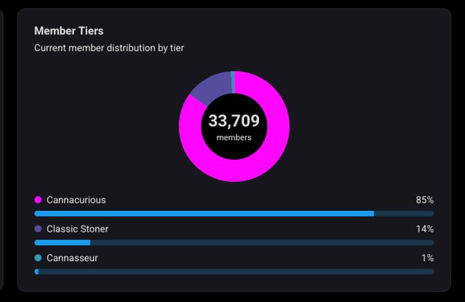
This card shows the current distribution of members across your loyalty tiers.
The center of the donut chart shows the total member count. Below it, each tier is listed with its share of total membership, shown as both a percentage and a bar.
Unlike the KPI row and Points Activity chart, this card isn't scoped to a date range — it reflects tier membership currently, not activity during a selected period.
Recent loyalty activity
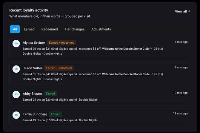
The activity feed shows one row per customer visit rather than one row per individual event. If a customer earned points and redeemed a reward in the same visit, that's a single row — for example: "Earned 624 pts on $62.40 of eligible spend · redeemed 20% reward 2 (−400 pts)."
Each row has a timestamp and links directly to that customer's profile. Filter chips at the top (All / Earned / Redeemed / Tier changes / Adjustments) narrow the feed. There's also a View all page with search, filtering, and date range paging — useful when you're tracking down a specific customer or day.
Reward Performance
This card shows, for the selected period, what each reward costs and what it brings back: how many times it was redeemed, how many points that used, how much sales came from those orders, and whether redemptions are trending up or down against the previous period. Each row links directly to that reward's settings.