
Insights Dashboard Builder
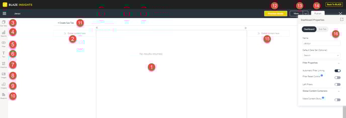
1. Dashboard sub-tab template: The mid-section of a dashboard displays the selected sub-tab template. This could either be the dashboard canvas, or a static layout.
The dashboard canvas has a fully flexible layout, that allows you to drop objects, such as reports, filters, texts, images, shapes, and more, anywhere. Whereas, a static layout has less flexibility but is simpler to build; if selected, you will not be able to use all the below dashboard features.
2 & 15. Global content container: Content containers on either side of the sub-tab, are where you can drop global objects that are visible on the entire dashboard, not just specific sub-tabs. The positioning of these objects will be fixed. These are ideal for adding filters.
Objects that can be placed in global content containers include filters and associated reports.
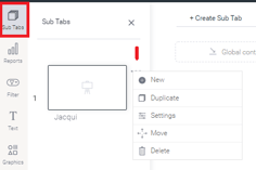
3. Sub tab button: Manage sub tabs contained in this dashboard. You can view a list of sub-tabs, reorder them, open a tab, or create a new sub-tab.
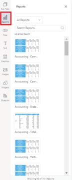
4. Report Widgets: Search for and add existing reports to the dashboard. If the report has snapshots and bookmarks, you can add those too.
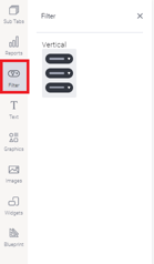
5. Filter Widgets: Drag filter widgets from this panel, to add filters anywhere on the dashboard.
6. Text Widgets: Drag a Text Widget onto the dashboard.
.png?width=149&height=263&name=textwidget%20(1).png)
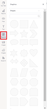
7. Graphic Widgets: The Graphics panels allow you to include graphical elements, such as shapes, icons, and lines to your dashboard.
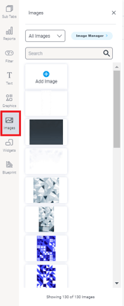
8. Image Widgets: This allows you to add a pre-existing image or a new one through the Image manager.
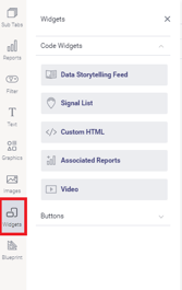
9: Code Widgets: Used to add Code Widgets or Action Buttons to your dashboard. This panel contains multiple out-of-the-box code widgets and action buttons, along with custom ones added by the users.
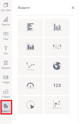
10: Blueprint: Allows users to wireframe a dashboard design, and upon further configuration, create Quick Charts directly on the dashboard.
11. Create SubTab: Click on this option to add another sub-tab to your dashboard. This initiates the tab creation process.
12. Preview Mode: Jump into preview mode to preview and test the dashboard in its working form, without publishing it.
13: More: This button lets you perform other actions on the dashboard. These include:
- Error check: This runs a check to see if report links are working.
- Refresh dashboard: The options re-runs all the reports in the dashboard.
- Rollback: This option rolls back to the previous version of the dashboard.
-
Delete Code Mode Content: Deletes all dashboard content created or edited in Code Mode.
(NOTE: This is only visible to users who have the Code Mode role function. It also only appears if the dashboard has any custom code added through Code Mode).
Warning: This action is irreversible and cannot be undone.
Tip: A dashboard edited in Code Mode will not run if the Code Mode configuration is turned off. However, if a permitted user deletes all Code Mode content, the dashboard will be able to run.
14: Publish: Use this to publish the dashboard, making it accessible to other users.
15: See number 2.
16: Dashboard Properties: This panel displays configuration properties for the dashboard or any selected object. You can use this to configure and customize the selected dashboard object, including changing color, font, background, positioning, size, and other details.
This panel can be easily moved, hidden, and expanded again.
17: Exit Button: Exits the dashboard builder. When existing, the following options will appear.
- Discard draft: delete the draft dashboard when closing it.
- Publish: Publish the dashboard. When publishing, you will need to define its name and description, select a folder to save it in, and specify user access details.
- Close: Close the dashboard builder. The dashboard will be auto-saved as a draft.