
A dashboard may consist of one or more tabs. Sub tabs could have the same or different templates between them. You may add another sub tab, but it doesn't have to have the same template as the main dashboard tab.
Overview
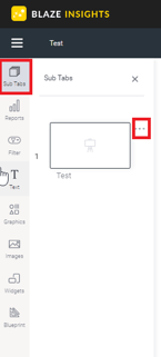
Sub Tab Panel
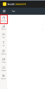
Click the Sub Tabs button on the left to expand the tab panel.
This panel allows you to perform the following functions:
- Re-order sub tabs: drag a sub tab above or below another sub tab to reorder your dashboard tabs
- Open sub tab: click the thumbnail of an existing tab to open it
- Create new tab: click the Plus Sign button at the bottom of the panel to create a new sub tab
- Change existing sub tab's layout: Use the settings option in a sub tab menu to change its layout. (See below for more information.)
Sub Tab Menu
- Use sub tab menu: Click on the 3Dots next to a tab thumbnail to bring up and use the sub tab menu
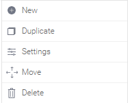
- New: Creates a new sub tab next to the selected one
- Duplicate: Creates a copy of the selected sub tab
- Settings: Allows you to change the layout of the selected dashboard
NOTE: You will lose objects solely supported in the canvas if you change its template to a layout.
- Move: Brings out a menu to move the sub tab's position in the dashboard. Options include:
- Up: Move the selected sub tab up a position (or to the left)
- Down: Move the selected sub tab
- Move to Beginning: Move the selected sub tab to the beginning of the dashboard
- Move to End: Move the selected sub tab to the end of the dashboard
- Delete: Delete the selected sub tab
Naming Sub Tabs
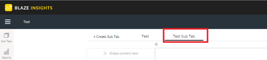
- You can name a sub tab when you first create it in the popup, through the Dashboard Property panel, or by double clicking on the tab name over the canvas.
Sub Tab Properties
The properties panel displays the properties of any object that is currently selected. To display a sub tab’s properties, select the sub tab you are interested in and then click on the Sub Tab option in the Properties panel. You can then view or edit these properties. See below for a breakdown:
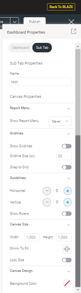
NOTE: These property options will differ based on the selected dashboard template; the dashboard layouts will have limited properties options, whereas the canvas will have all.
- Name: view or update the name of the sub tab
- Canvas Properties: properties available only on a dashboard canvas. NOTE: These will not be provided for static layouts
- Report Menu: This controls the visibility of the menu that pops up on all reports added to the canvas
-
Show Report Menu:
- Inherit: the report menu will inherit the visibility setting from the admin level. The report menu is also controlled at the admin level and individual report level
- Never: (Default selection) the report menu will never appear. Use this to hide the menu from appearing in published dashboards. It still appears on hover in edit mode
- Always: the report menu will always appear. For static layout dashboard, this will make the menu constantly appear in both edit and published modes; however, for canvas dashboards, it will continue to hover in edit mode, and always appear in published mode
- Hover: the report menu will only appear as long as users hover over it
-
-
Gridlines:
- Show gridlines: enable this toggle to make gridlines appear on the sub tab canvas. These can be used as a guide when laying out widgets.
- Gridline size: specify the size of the grids in the gridlines (in pixels)
- Snap to Grid: Enabled this toggle to align all new objects to gridlines. NOTE: if objects were added prior to enabling this setting, they will not align automatically; they will need to be moved manually.
-
Guidelines:
- Horizontal: allows you to add up to 2 horizontal guidelines on the canvas. These are visual guides that can be moved to aid in the design of your canvas. NOTE: you can easily drag a line to a different location.
- Vertical: allows you to add up to 2 vertical guidelines on the canvas. These are visual guides that can be dragged to aid in the design of your canvas.
- Show rulers: allows you to display rulers across the top and left of your canvas, which can be used to place guidelines more accurately
-
Canvas Size:
-
Width: specify the width of the sub tab canvas
Height: specify the height of the sub tab canvas
Shrink to fit: Click on this to shrink the canvas size to the minimum size to fit all current objects. This will remove unnecessary whitespace from the canvas.
Lock size: Enable this toggle to lock the size of the dashboard canvas. This will prevent the canvas from being manually dragged or resized.
-
-
Canvas Design:
- Background color: Specify a background color for the sub tab canvas. Click to select a color; this brings up the color picker.