
Adding text to your dashboard can be done via text widgets. Choose text widgets of different styles and then customize them exactly as you need them via the text widget properties panel.
Overview
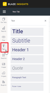
The default styles represent typical formatting defaults, such as headings and paragraphs.
How to use Text Widgets
- Click on the Text Widget button on the left side of the screen.
- Choose your desired default style, and drag the widget to where you wish to display it on the dashboard.
- Click on the dropped widget to drag it to a new location in the dashboard, and click again to enter text entry mode: you will see the blinking cursor indicating that you can enter text.
- You can customize the text through the text widget’s properties panel. This panel appears on the right side once the text widget is selected. See the Properties section below for more details.
- You can also add an action event that will be triggered when this widget is clicked. See the Actions section in the widget's property table below for more information.
- Additional options are available by right-clicking and using the menu that appears. Learn more about the menu options here.
NOTE: You can use a variety of standard keyboard shortcuts within the text widget, from formatting properties such as bold to undo the last change. See the full list.
Text URLs
Users can link text objects to external or internal URLs. Clicking on the linked text will navigate the dashboard users to the linked page. You can add a link to the entire text object, or a selected portion.
- Add a Text object, and update the text.
- Select text that you wish to add a link to. This can be partial or the full text.
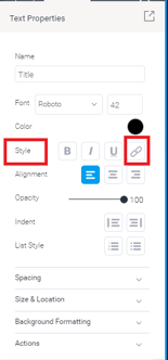
- The property panel of the text object will be on the left hand side. In the Style setting, click on the link button.
- A new panel will pop up on your screen.
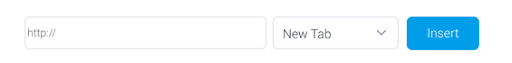
- Enter the URL to link to, and select if the page should open in a new or current tab for the user.
- Click Insert.
- Us
NOTE: We recommend not adding a URL to the Text object, if an Action Event has been applied to it.
Text Widget Properties
The table below describes the text widget properties that can be used to customize the appearance and behavior of a text widget.
Tip for customizing text font: You can apply certain changes to only the selected or highlighted text within a text widget. Once these settings are defined, they will affect any new text entered. These settings include font type and size, color, style, opacity and indent.
-
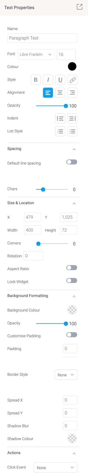
Name: Allows you to edit the system-generated default name of the selected text widget. Tip: Giving your widget an easy name, will allow you to further customize it in Code Mode.
-
Font: Lets you change the font type and size of the selected text.
-
Color: Lets you specify the color of the selected text.
-
Style: Allows you to apply a formatting style to the selected text. Options include bold, italic, underlined, and adding URLs.
-
Alignment: Allows you to align the contents of the text widget.
-
Opacity: Allows you to define the transparency of the selected text. The lower the number on this slider, the more transparent the text will be.
-
Indent: Allows you to add or remove indentation within the text.
-
List style: Allows you to format text as bullet points or a numbered list.
-
Spacing: Default line spacing This is enabled by default. If you prefer to set your own line spacing, toggle this setting to disable it and use the manual Line option (described next) instead.
-
Chars: This allows you to define the amount of spacing between each character in the selected text widget. The higher the number, the more space allocated.
-
Size & Location
-
X: Specify the x coordinates of the top left corner of the text widget, in order to position it exactly on your dashboard canvas.
-
Y: Specify the y coordinates of the top left corner of the text widget, in order to position it exactly on your dashboard canvas.
-
Width: Specify the width of the text widget, in pixels, in order to resize it exactly.
-
Height: Specify the height of the text widget, in pixels, in order to resize it exactly.
-
Corners: This option allows you to define the roundness of your text widget border corners. Tip: For maximum circular edges, enter half the value of the widget height. For example, if the height is 400 pixels, then set the edge value to 200 pixels. Moreover, any value greater than 200 for the edge, will have no further effect in this example.
-
Rotation: Specify the amount you wish to rotate your widget clockwise, in degrees. To rotate anti-clockwise, specify a negative value.
-
Aspect ratio: Enable this toggle to maintain the aspect ratio. This means the widget maintains its shape, but its size can be increased or decreased.
If this is disabled, the widget can be stretched out of shape either vertically or horizontally.
-
Lock widget: Enable this toggle to lock the text widget in its location. This stops you from moving or resizing the widget. This holds true even when selecting multiple widgets on the canvas. The text widget can still be edited.
-
Background formatting
-
-
Background color: Allows you to specify a background color for the text widget. This refers to the area within the widget, excluding the text content.
-
Opacity: Allows you to specify the transparency of the background color on the widget.
-
Customize padding: This option allows you to define a custom padding or buffer around the text widget, in pixels. This includes padding for each side to the widget. If disabled, you can still define an overall padding size.
-
Padding: This allows you to define an overall padding size for the text widget. This size, defined in pixels will be constant on each side of the widget. To add different sized padding on any of the sides, enable the Customise Padding option.
-
Border style: This allows you to select a style for the widget border. Options include: dashed, solid, dotted, groove, and more.
-
X: Specify the x coordinates of the top left corner of the background border, in order to position it exactly on your dashboard canvas.
-
Y: Specify the y coordinates of the top left corner of the background border, in order to position it exactly on your dashboard canvas. -
Shadow blur: This option allows you to define the sharpness of the shadow. The smaller the value, the sharper and more defined the shadow will be. For a blurry or softer shadow, provide a bigger value.
-
Shadow color: This option allows you to set a color for the shadow.
-
-
Actions
-
Click Event: Select an event that will trigger when the selected widget is clicked. Event options include:
None: Use this if you do not wish the widget to trigger an event.-
Next sub tab: Navigates the user to the next tab within the same dashboard.
-
Previous sub tab: Navigates the user to the previous tab within the same dashboard.
-
Reset filters: Allows users to clear filter selections, or in case default values are set, then reset filters to their default values.
-
Reset dashboard: Refreshes the dashboard by clearing any user interactivity performed on it, as well as removing all applied filters.
-
Go to report: Navigates users to a specified report. This report can be specified by providing its report UUID.
-
Go to sub tab: Navigates to any sub tab in the same dashboard, where the sub tab is specified by its order number. For example to jump to the fourth sub tab, enter 4 in the sub tab # field. The sub tab order starts from number 1.
-
Go to URL: Navigates to an external link or page using the specified URL. You can also choose to open the new link in a new tab or window or in the current window.
-
-
Text editor keyboard shortcuts
The following keyboard shortcuts work within the text editor.
|
Action
|
PC
|
Mac
|
|---|---|---|
| Bold | Ctrl+B | Command+B |
| Italic | Ctrl+I | Command+I |
| Underline | Ctrl+U | Command+U |
| Select All | Ctrl+A | Command+A |
| Redo | Ctrl+Y / Ctrl+Shift+Z | Command+Y / Command+Shift+Z |
| Undo | Ctrl+Z | Command+Z |
| Header 1 | Alt+Shift+1 | Ctrl+Option+1 |
| Header 2 | Alt+Shift+2 | Ctrl+Option+2 |
| Header 3 | Alt+Shift+3 | Ctrl+Option+3 |
| Header 4 | Alt+Shift+4 | Ctrl+Option+4 |
| Header 5 | Alt+Shift+5 | Ctrl+Option+5 |
| Header 6 | Alt+Shift+6 | Ctrl+Option+6 |
| Paragraph | Alt+Shift+7 | Ctrl+Option+7 |
| Div | Alt+Shift+8 | Ctrl+Option+8 |
| Address | Alt+Shift+9 | Ctrl+Option+9 |
| Insert link | Ctrl+K | Command+K |